Colour in Computer Vision
How a machine sees colour
When you take a photo, depending on the light, the type of camera you use and the screen you are viewing the image on, you see it from a certain perspective. A model may or may not recognise an image or the colours within it, it might have the ability to recolour it or highlight an interface. There are a set amount of RGB colour values with labels, many of which are used to measure human perception, which are trained to get the model to recognise each colour. CNNs (convolutional neural networks) and subsequently DNNs (deep neural networks), have struggled with colour variants. With the aid of computer vision and vision language models (VLMs) we are starting to see a different way of colour generation and accessibility.
Two benchmarks, COLORSENSE and COLORBENCH measure how machines see colours in two different ways.
Chiu et al. (2022) investigated how recognition relates to the colours of an object and its background. They used human colour annotations to group images by the difficulty of distinguishing foreground from background and came up with a benchmark called COLORBENCH . Across the evaluated models, recognition accuracy generally falls when those colours are similar. In the paper’s human comparison, participants largely preserve their accuracy on difficult colour pairs, although they take slightly longer.
An overall recognition score can conceal differences between colour conditions. For example, we would want to know whether a model remains reliable when a red apple and its background look similar.
Recognising an object and reasoning about its colour need separate tests
Liang et al. (2025) broadens this to vision-language models within COLORBENCH by aiming to understand systems that respond to images and language together. Its tasks cover colour perception, reasoning and robustness. These include identifying colours, comparing or counting them, and testing responses under colour transformations.
The results in the paper show that these abilities develop unevenly. Models can perform relatively well on basic colour recognition while finding colour counting, proportions and illusions more difficult. This makes it useful to ask more specific questions than whether a model “understands colour”. A model that names the apple’s colour correctly still needs to be tested on how it uses that information in a more complex task.
How colour is formed and perceived
Before a machine can interpret colour, light has to become an image. Light reflects from an object and reaches an eye or a camera sensor. Its appearance depends on the light source, the surface and the observer. A red apple photographed in daylight can produce different colour values from the same apple photographed under a warm indoor lamp, even though we may still recognise its colour as red. This relative stability in our perception is called colour constancy. For computer vision (CV), separating the effect of lighting from the colour of the object is part of the challenge.
Building colour with light and ink
In computer vision, images are commonly represented using RGB (red, green and blue). On a screen, these three colours of light combine in different amounts to create the colours we see. Adding or removing light makes the result brighter , and combining the three at their maximum produces the display’s white. Digital photographs, computer graphics and displays all make use of RGB.
RGB is a colour model, while a colour space defines how those numbers relate to particular colours. For example, sRGB is widely used for web images, while Adobe RGB supports a wider range of colours in parts of the spectrum and is used in photographic and print workflows. The distinction matters because an RGB value needs a defined colour space to give it a consistent meaning across devices (Muratbekova et al., 2025).
Printing takes a different approach. CMY combines cyan, magenta and yellow inks, which absorb parts of the light falling on the paper. This is a subtractive model. CMYK adds black ink, giving printers a practical way to produce deeper blacks and clear dark detail. An image prepared in RGB may therefore need to be converted for a CMYK printer, with the result depending on its inks and paper. These models help us reproduce an image in different media; CMYK is mainly useful at the printing stage rather than being a necessary step in machine recognition.
Choosing a representation for the job
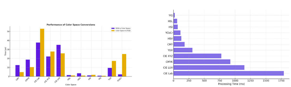
The choice of model affects both the work a computer performs and how easily a person can interact with colour. In Color Models in Image Processing: A Review and Experimental Comparison, Muratbekova et al. (2025) tested conversion speed and asked seven experts to match a target colour using different colour-picker controls. These offer two perspectives, how much processing a conversion requires and how easily people can use its controls. The experiments did not directly test object-recognition accuracy or compression quality.
In the study’s test on a 200 × 200 image, YIQ took about 21 milliseconds, HSL 58 milliseconds and HSI 69 milliseconds, compared with around 1,790 milliseconds for CIELAB. These timings describe the authors’ implementation, rather than fixed speeds for every system. They show why conversion overhead is important when processing a continuous camera feed. A fast conversion leaves more time for other tasks but does not guarantee a real-time system or more accurate recognition on its own.
Representations such as YCbCr, used in many JPEG and video workflows, store a brightness-related component separately from colour-difference components. This allows a compression system to retain more brightness detail while reducing fine colour detail, which is often less noticeable to a viewer. For computer vision, it also prompts the question of, does the compressed image still preserve the small coloured features the model needs to interpret?
Colour descriptions can also allow uncertainty. A person might describe a shade as somewhere between red and orange. The review discusses COLIBRI, which uses overlapping colour categories to represent this kind of description. Such an approach could help a person search for images or adjust colours using familiar words. It offers a useful direction for human-centred tools, although the colour-picker experiment does not establish its accessibility for people with different colour-vision experiences.
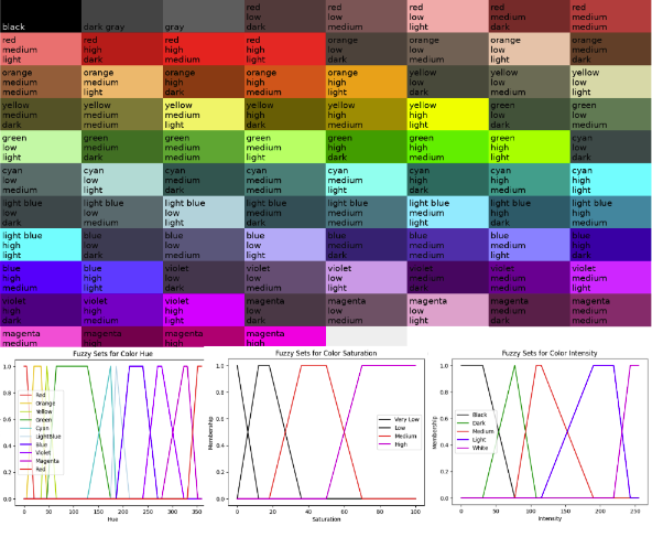
These choices connect the image we see to the information a machine receives. RGB can represent the captured image, a different representation can support processing or compression, and CMYK can reproduce it in print. Human-oriented descriptions can then help someone interpret or control the result. Changing representation alone does not solve colour constancy, the system still needs to account for lighting. It does, however, provide different ways to organise colour information for each stage of the image’s journey.
Color Constancy
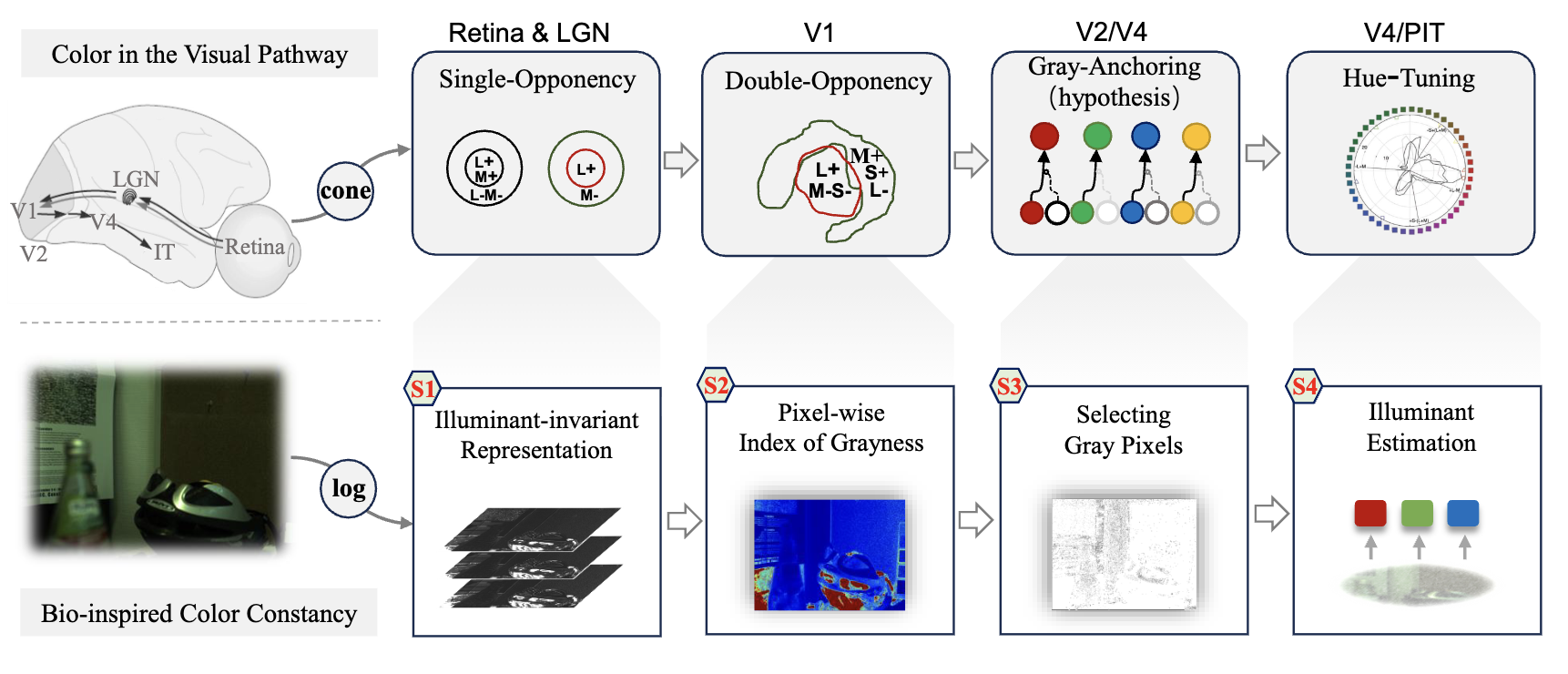
Colour constancy helps a computer account for changes in lighting, so the same object can retain a more consistent colour across images. In Bio-inspired Color Constancy, Yang et al. (2026) took inspiration from biological vision by looking for “grey anchors”, surfaces likely to be neutral grey. If one appears warm or blue in a photograph, it provides a clue to the colour of the light illuminating the scene.
Their Gray-Pixel Network (GPNet) learned to find these reference pixels and use them to estimate the lighting. On the two datasets tested, it outperformed the hand-designed grey-pixel methods compared and achieved results comparable to larger learning-based approaches. This suggests that simple clues about a scene can help a small model correct colour effectively, although the approach depends on finding suitable reference pixels and does not establish that the model perceives colour as people do.
Color Pass-Through via Camera-Display Coupling
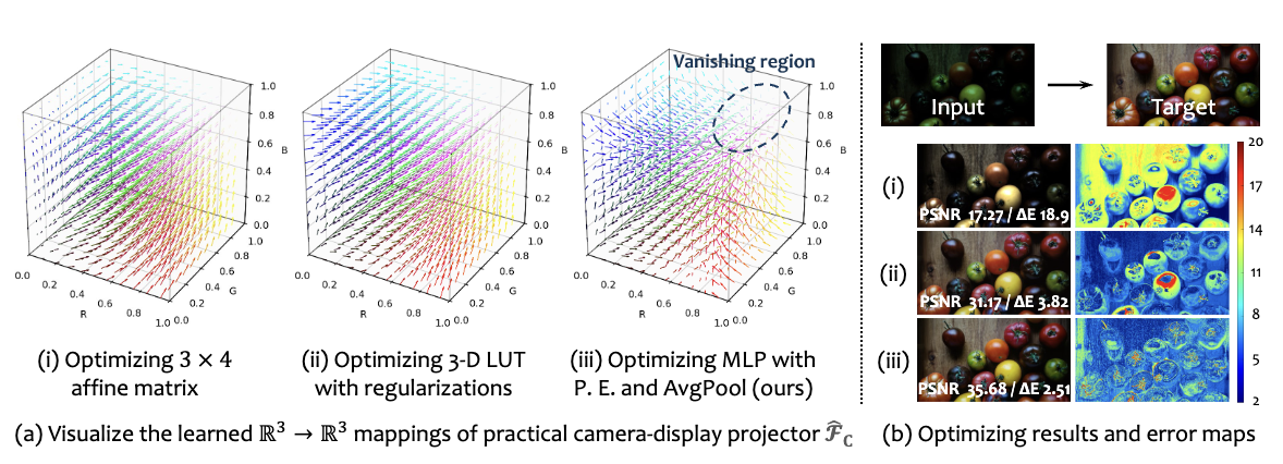
Colour can also change between taking a photograph and viewing it on a screen. In Color Pass-Through, Li et al. (2026) treat the camera and display as one connected system, learning how to translate captured colours into a closer reproduction of the original scene. They also account for the fact that a match measured by a camera may look different to a person, using a calibration step for the particular observer.
Across the two phones tested, the method reduced average colour error from roughly 15–18 to around 5, while a small study of ten people also favoured its reproduction of colour and brightness. The image above illustrates how different mappings affect the result. For computer vision, this highlights why colour needs to be considered throughout the journey from capture to display. The values a machine records and the appearance a person sees are connected but matching one does not automatically guarantee the other.
What a camera records
For computer vision, the useful question is how the recorded colours are represented when an algorithm processes them. RGB provides a familiar starting point, but numerical differences between RGB values do not always match the differences people perceive. This matters when a system groups similar pixels, extracts an image’s main colours or identifies regions by colour. Its definition of “similar” depends partly on the representation and comparison method it uses.
Different colour spaces and models make different properties easier to work with. HSV and HSL separate hue from measures of saturation and brightness or lightness, which can help with selecting coloured regions. CIELAB is designed to make numerical colour differences correspond more closely to perceived differences, although that correspondence is approximate (Muratbekova et al., 2025). The practical choice depends on the task of finding a coloured object and judging whether two shades look alike may need different comparisons. Changing colour space can support that processing but it does not recover information lost during capture or automatically improve a model’s recognition accuracy.
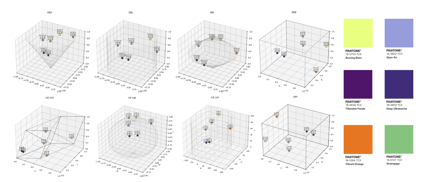
These plots place the same six reference colours in different colour models. Their coordinates and spacing change with the representation, which matters when an algorithm groups pixels by colour similarity. The plots illustrate those differences; they do not establish which model gives the best recognition results.
Keeping colour stable across lighting and cameras
A further challenge is making colour correction work when the camera changes. GCC uses a diffusion model to generate a virtual colour checker, a chart of reference patches, as it might appear under the scene’s lighting. It then uses the generated grey patches to estimate that lighting, without needing a real chart in the photograph (Chang et al., 2025). CCMNet instead uses the camera’s existing calibration information to help its model adapt to an unfamiliar sensor without retraining (Kim et al., 2025). Both approaches showed promising results when evaluated across different cameras, although GCC can generate a plausible but inaccurate lighting estimate, and CCMNet relies on suitable calibration data.
For computer vision, their relevance is the prospect of more consistent colour information when images come from different devices or environments. That could help systems that use colour to distinguish objects or regions, but the reported improvements concern illumination estimation; they do not establish better object recognition. This makes colour correction a useful preparation step.
From recognising objects to naming and reasoning about colour
The earlier COLORSENSE and COLORBENCH results give us a starting point. Colour affects recognition, and using it to answer a question introduces further demands (Chiu et al., 2022; Liang et al., 2025).
CLIP, short for Contrastive Language–Image Pre-training, learns from paired images and text, turning each into a numerical representation so that matching descriptions and images score more similarly than unrelated pairs (Radford et al., 2021). This supports tasks such as finding an image from a description or comparing an image with possible labels. The image encoder with CLIP can also provide visual representations to larger vision-language systems.
In Color in Visual-Language Models: CLIP deficiencies, Arias et al. (2024) found that CLIP often prioritised a written colour word over the colour of its lettering. Think of “red” printed in blue, reading the word and identifying the ink require different answers. The study also found that black, white and grey could be overlooked in favour of a coloured region elsewhere in the image. The pitfall is therefore more specific than choosing the wrong colour name. A model may rely on the wrong visual cue or assign a colour to the wrong region. These findings come from controlled synthetic tests, so they should not be assumed to describe every VLM or everyday image.
Language introduces another source of variation. Gomez-Villa et al. (2025), in Color Names in Vision-Language Models, found stronger agreement with human categories for typical colours than for a wider range of shades. Naming also varied with language and the model’s language component. This is important when interpreting an answer. A detailed description does not necessarily indicate finer visual discrimination and two different names need not imply that two models detected different pixel colours. The wording reflects both visual information and how the system has learned to describe it.
For colour reasoning, the practical challenge is to keep the answer tied to the relevant evidence throughout the task. For example, counting red objects requires identifying separate objects, judging their colours and combining those judgements correctly.
Learning from colour perception studies to build better models
One way to improve colour understanding is to change how an image is presented while keeping the task the same. This helps researchers identify which visual changes affect an answer and test whether a proposed improvement addresses them. Colour patterns, spatial detail and text contrast each provide a different way to investigate that relationship.
In ColorBlindnessEval, Ling et al. (2025) embed numbers in coloured dot patterns inspired by Ishihara plates. Comparing these with clearer versions helps separate basic number recognition from the difficulty of finding a number among competing colours and textures. The tested models performed much better on the clear images. The benchmark therefore offers a useful test of visual interference, although its name needs care; failing these images does not mean a model has human colour blindness. Its small human comparison also excluded people with colour-vision deficiencies, so it cannot establish how well a system supports those users.
Colour can also affect whether a model brings small details together into a recognisable object. Basoc et al. (2026) explored this by introducing stripes and grids into images in Spatial Colour Mixing Illusions. Recognition deteriorated across the tested VLMs, and increasing language-model size did not reliably resolve the problem. A more encouraging result came from changing the input. Blurring or shrinking and enlarging the image helped recover recognition for some patterns in the tested Gemma model. These operations suppress distracting fine detail, making the larger structure easier to identify. They did not help every distortion, but the result shows that investigating how an image reaches the model can reveal improvements beyond simply making the model larger.
For text in images, the useful test is whether interpretation remains consistent when only the styling changes. In Seeing Red, Thinking Bad, Ide et al. (2026) found that colouring selected words could shift sentiment judgements, while reducing contrast encouraged some models to rely on the most visible words. This provides a reason to test document-reading systems with several presentations of the same content. Comparing answers with text extracted through optical character recognition (OCR), or with a version using consistent formatting, could help reveal sensitivity to presentation.
Displays and perceptual evaluation
Holographic displays offer a useful example of why colour accuracy needs to be checked beyond the image file. They shape light waves to produce images with depth, using lasers and optical components that can alter how colours appear. A camera measuring the result also introduces its own response to colour. As the earlier Color Pass-Through study showed, matching what a camera records does not automatically establish a match for a human observer (Li et al., 2026).
PAColorHolo addresses this by combining a colour space suited to the holographic display, a small neural network that corrects the camera’s colour measurements, and adjustments to the balance of the laser light (Chen et al., 2026). The system repeatedly displays a hologram, captures it and uses the corrected measurements to improve the result. Cptured images provide feedback that helps control the display. In the reported comparison, average colour error fell from 9.11 to 5.39, and the researchers also evaluated perceived colour differences with human observers. These findings support better colour reproduction in the tested setup, rather than of improved object recognition.
Mehmood et al. (2026) compared six VLMs with human judgements of contrast, colourfulness and overall preference across different renderings of the same scenes. Agreement depended on the attribute being judged, and no model consistently matched people across all three. A model could give repeatable answers without closely matching human judgements, especially when differences between images were subtle. This suggests that automated assessments can support evaluation but should be checked against people for the qualities that matter to the intended use.
For computer vision systems that present results visually, the lesson is to assess both the output and its use. Colour measurements can help identify reproduction errors; human comparisons can establish whether a change is perceptible or preferred, and task-based testing can check whether people correctly interpret the displayed information. Holography makes the interaction between camera, display and observer particularly visible but the same questions matter for coloured overlays, annotations and other visual explanations.
Accessible colours
Colour-vision deficiency can make particular colour distinctions difficult, while low vision can affect the visibility of text and detail. These needs overlap but a contrast check alone cannot establish that every colour-coded message is understandable.
For computer-vision interfaces, colour should be accompanied by another way to understand the result. Labels, shapes, patterns and line styles can distinguish categories even when their colours are difficult to separate. This follows the principle in WCAG’s guidance on the use of colour: meaning should not depend on colour alone (W3C, n.d.). A detection overlay could name the object beside its outline, for example, while a heatmap could include labelled values or contours. Adjustable palettes can help, provided the meaning of the categories remains consistent as their appearance changes.
ColorA11Y offers a useful example of bringing this support into the creation process. Siu et al. (2026) developed a tool that checks text against backgrounds such as photographs and textures, then suggests changes to text colour, backing or opacity. The preferred intervention varied with the background. Its attention to local contrast matters because a label can be readable over most of an image and disappear over one small region. In the eight-participant workflow study, the tool improved text-contrast compliance compared with a baseline checker. This supports timely, context-sensitive guidance, although the study did not establish effectiveness for people with colour-vision deficiency or low vision.
A similar approach could help computer vision systems place readable annotations or flag overlays that blend into the scene. That is a proposed application, rather than a result demonstrated by ColorA11Y. It would need evaluation with people with different visual experiences, checking whether they can identify the intended objects, categories or warnings. Colour vision simulations can help reveal potential problems, but they cannot replace that participation. The goal is to preserve the information the model is communicating and give users practical control over how it appears.
What would better colour in computer vision look like?
The studies point towards several directions worth testing. At capture, camera calibration and joint camera display modelling already offer ways to reduce colour inconsistencies. Further work could examine how well these approaches transfer across sensors, lighting conditions and observers, and whether capturing more spectral information would justify the additional hardware and processing. Within models, training could explicitly reward perceptually meaningful colour differences, allow overlapping colour categories and use controlled colour changes to test what should remain stable. An apple should still be recognised after recolouring but an answer about its colour should change.
Evaluation needs to separate these abilities. Researchers could vary hue, luminance, saturation, spatial detail and context independently, then report performance and uncertainty for each task, device and participant group. For interfaces and any colour edits, the aim should be precise, user-adjustable control that preserves image structure and meaning, alongside labels or patterns that make the output accessible. These are directions to investigate; the papers have not demonstrated a single approach that achieves all of them.
References
Anwar, S., Tahir, M., Li, C., Mian, A., Khan, F.S. and Muzaffar, A.W. (2020) ‘Image Colorization: A Survey and Dataset’. arXiv, 2008.10774. arXiv:2008.10774.
Arias, G., Baldrich, R. and Vanrell, M. (2024) ‘Color in Visual-Language Models: CLIP deficiencies’, Color and Imaging Conference, pp. 101–106. doi:10.2352/CIC.2024.32.1.20.
Basoc, N.-N., Cosma, A. and Radoi, E. (2026) ‘Spatial Colour Mixing Illusions as a Perception Stress Test for Vision-Language Models’. arXiv, 2603.06141. arXiv:2603.06141.
Burambekova, A. and Shamoi, P. (2024) ‘Comparative Analysis of Color Models for Human Perception and Visual Color Difference’. arXiv, 2406.19520. arXiv:2406.19520.
Cao, Y., Duan, X., Meng, X., Mok, P.Y., Li, P. and Lee, T.-Y. (2024) ‘Computer-aided Colorization State-of-the-science: A Survey’. arXiv, 2410.02288. arXiv:2410.02288.
Chang, C.-W., Fan, C.-D., Chang, C.-C., Lo, Y.-C., Tseng, Y.-C., Huang, J.-L. and Liu, Y.-L. (2025) ‘GCC: Generative Color Constancy via Diffusing a Color Checker’. arXiv, 2502.17435. arXiv:2502.17435.
Chen, C., Chae, M., Nam, S.-W., Choi, M.-H., Kim, M., Lee, E., Jeong, Y. and Park, J.-H. (2026) ‘PAColorHolo: A Perceptually-Aware Color Management Framework for Holographic Displays’. arXiv, 2601.14766. arXiv:2601.14766.
Chiu, M.-C., Wang, Y., Kim, D.E.G., Chen, P.-Y. and Ma, X. (2022) ‘COLORSENSE: A Study on Color Vision in Machine Visual Recognition’. arXiv, 2212.08650. arXiv:2212.08650.
Ehab, E., Hernández-Cámara, P., Belal, N., Malo, J., Vazquez-Corral, J. and Gomez-Villa, A. (2026) ‘Do Vision Encoders Exhibit Human-like Color Thresholds?’. arXiv, 2607.16540. arXiv:2607.16540.
Gomez-Villa, A., Hernández-Cámara, P., Butt, M.A., Laparra, V., Malo, J. and Vazquez-Corral, J. (2025) ‘Color Names in Vision-Language Models’. arXiv, 2509.22524. arXiv:2509.22524.
He, M., Chen, D., Liao, J., Sander, P.V. and Yuan, L. (2018) ‘Deep Exemplar-based Colorization’. arXiv, 1807.06587. arXiv:1807.06587.
Ide, K., Yamada, R., Fukuhara, Y., Kataoka, H. and Satoh, Y. (2026) ‘Seeing Red, Thinking Bad: Color Bias in Vision Language Models’. arXiv, 2608.14286. arXiv:2608.14286.
Igali, A. and Shamoi, P. (2026) ‘Beyond Color Geometry: Evaluating Human-Like Color Representations in Vision Models’. arXiv, 2607.13647. arXiv:2607.13647.
Kim, D., Afifi, M., Kim, D., Brown, M.S. and Kim, S.J. (2025) ‘CCMNet: Leveraging Calibrated Color Correction Matrices for Cross-Camera Color Constancy’. arXiv, 2504.07959. arXiv:2504.07959.
Li, R., Li, M., Wu, J., Wei, Z., Liu, P. and Xue, T. (2026) ‘Color Pass-Through via Camera-Display Coupling’. arXiv, 2607.12746. arXiv:2607.12746.
Li, Y., Yang, S. and Liu, J. (2025) ‘Language-based Image Colorization: A Benchmark and Beyond’. arXiv, 2503.14974. arXiv:2503.14974.
Liang, Y., Li, M., Fan, C., Li, Z., Nguyen, D., Cobbina, K., Bhardwaj, S., Chen, J., Liu, F. and Zhou, T. (2025) ‘COLORBENCH: Can VLMs See and Understand the Colorful World? A Comprehensive Benchmark for Color Perception, Reasoning, and Robustness’. arXiv, 2504.10514. arXiv:2504.10514.
Liang, Z., Li, Z., Zhou, S., Li, C. and Loy, C.C. (2024) ‘Control Color: Multimodal Diffusion-based Interactive Image Colorization’. arXiv, 2402.10855. arXiv:2402.10855.
Ling, Z., Zhang, H., Zhou, Y. and Cui, J. (2025) ‘ColorBlindnessEval: Can Vision-Language Models Pass Color Blindness Tests?’. arXiv, 2509.19070. arXiv:2509.19070.
Mehmood, I., Shah, I.A., Luo, M.R. and Deegan, B. (2026) ‘Evaluating Vision-Language Models for Image Quality Assessment using Psychophysical Data’. arXiv, 2603.24578. arXiv:2603.24578.
Mohammad, N. and Balinsky, A. (2009) ‘Colorization of Natural Images via L1 Optimization’. arXiv, 0905.2924. arXiv:0905.2924.
Muratbekova, M., Toganas, N., Igali, A., Shagyrov, M., Kadyrgali, E., Yerkin, A. and Shamoi, P. (2025) ‘Color Models in Image Processing: A Review and Experimental Comparison’. arXiv, 2510.00584. arXiv:2510.00584.
Siu, A., Jain, R., Kannan, A., Echevarria, J., Jawili, M.A., Prasad, Y.S., Treitman, R., Tigwell, G.W. and Lazar, J. (2026) ‘ColorA11Y: Enhancing Creative Design Workflows with Just-in-Time Color Accessibility Recommendations’. arXiv, 2608.23852. arXiv:2608.23852.
Yang, K.-F., Luo, F.-Y. and Li, Y.-J. (2026) ‘Bio-inspired Color Constancy: From Gray Anchoring Theory to Gray Pixel Methods’. arXiv, 2604.20243. arXiv:2604.20243.
Yang, Y., Chang, D., Ling, Y., Du, R. and Ma, Z. (2026) ‘Recolour What Matters: Region-Aware Colour Editing via Token-Level Diffusion’. arXiv, 2603.18466. arXiv:2603.18466.
Zhang, R., Isola, P. and Efros, A.A. (2016) ‘Colorful Image Colorization’. arXiv, 1603.08511. arXiv:1603.08511.